2.7 Elements do not look interactive (H)

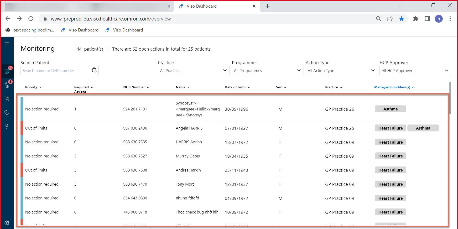
FIGURE 2.13: Elements within the clinician dashboard highlighted on the monitoring page

FIGURE 2.14: Button elements on the Monitoring Patient Information page
2.7.1 WCAG 2.1.1 (A), 2.4.4 (A), 3.2.4 (AA) - Desktop
On the clinician dashboard on the Monitoring page, the rows of the table are presented as plain text. However, these rows function as interactive elements: clicking anywhere within the row of this table opens a page containing the patient info.
Users are not informed that these elements are clickable unless they hover over it with a pointing device (since these elements are not keyboard accessible either, as discussed in Dashboard elements not keyboard accessible (H) ).
This inconsistency in how the elements are presented affects the usability of this system: users wouldn’t be aware of the functionality provided unless they happen to click on the table element. Users would expect something interactive to look like a link or a button, not plain text.
Similarly, users would expect all button elements to look visually similar. For instance, ‘Patient Settings’ and ‘Manage Programmes’ are both buttons on the Monitoring page, however, the mismatch in styling causes them to appear functionally different. The grey outline of the ‘Patient Settings’ button also makes it look disabled.
2.7.2 Recommendation
Ensure that interactive elements are visually presented as such to users. Similar elements should be styled similarly for easier identification.
We recommend adding a new column with the button ‘See patient details’ for each row. This button should be programmatically associated with the patient’s name so that screen reader users are informed which row the button corresponds to.
2.7.3 Spot check: December 2022
This issue is unresolved. Please refer to the recommendation above to fix the issue.